Decisions on the EASA logo has to be made before web design can commence. The graphic used in the logo, as well as it’s fonts and colours, form the design starting point for the website.
Option 1: New logo
If there will be a new logo, work on that should start now, meaning, finding a logo designer and creating a brief. A new logo will require decisions on font both for the abbreviation (EASA) and the two full titles in English and French.
Option 2: Refresh the old logo
If we are to refresh the current logo but not replace it, then we need decisions on fonts and colours. NomadIT can supply samples for this purpose, using the old logo swirl and current logo text.
Option 3: We keep the current logo with no changes.
Logo versions
The logo should come in the following versions:
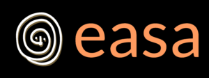
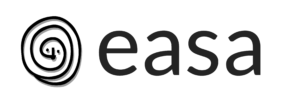
short
full
icon
optional: panoramic
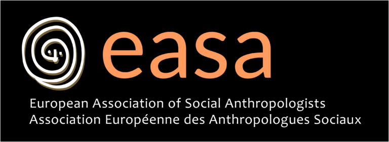
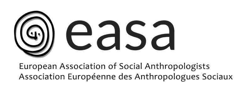
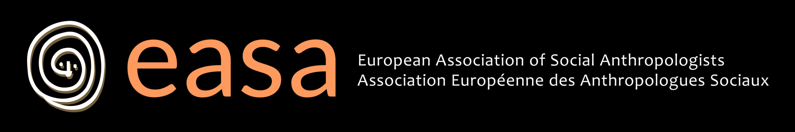
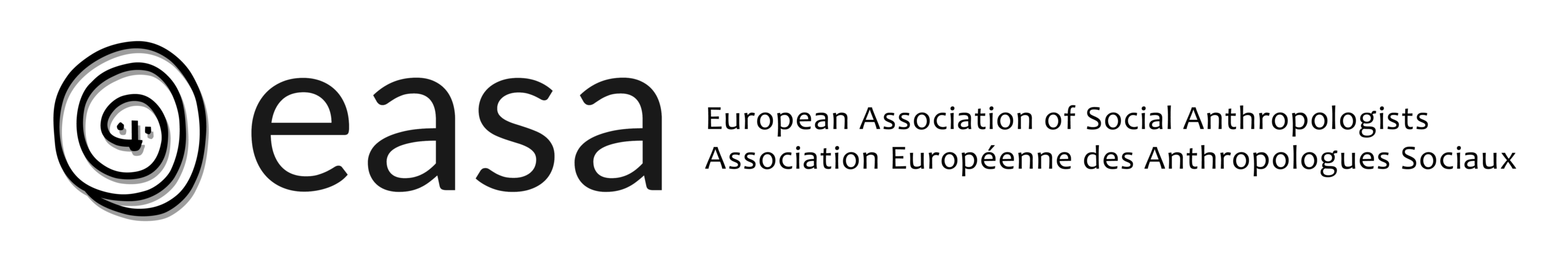
As illustrated below, all these should be supplied in two colour versions: full colour and black and white. As an option could also be an inverted logo, in white/light on a black/dark background, ie used for dark t-shirts and also in very small versions, as light text on a dark background is more legible.
Logo files should be supplied in the following formats:
photoshop .psd with all the layers intact
.svg
.jpg
.png on transparent background
Parts of a logo
The logo will ideally include
Logomark, which acts as an avatar for the organisation/conference, also used as favicon in browser tags). (here: EASA spiral)
Wordmark (here: EASA)
Tagline (here: European Association of Social Anthropologists / Association Européenne des Anthropologues Sociaux
Note: A logo mark is not strictly necessary, the logo could simply be the title of the conference/organisation in specified fonts and colours.
Note: where the tagline is long and necessary for the identification of the association, choose a font which is legible in a small size, and specify the minimum size of the logo.
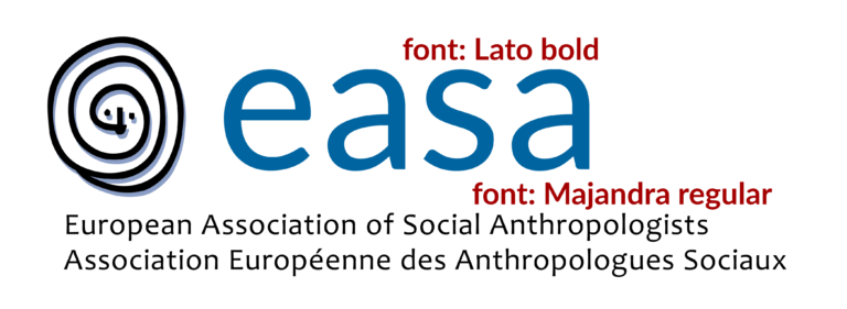
Fonts used in the logo
Note: where the tagline is long and necessary for the identification of the association, choose a font which is legible in a small size, and specify the minimum size of the logo.
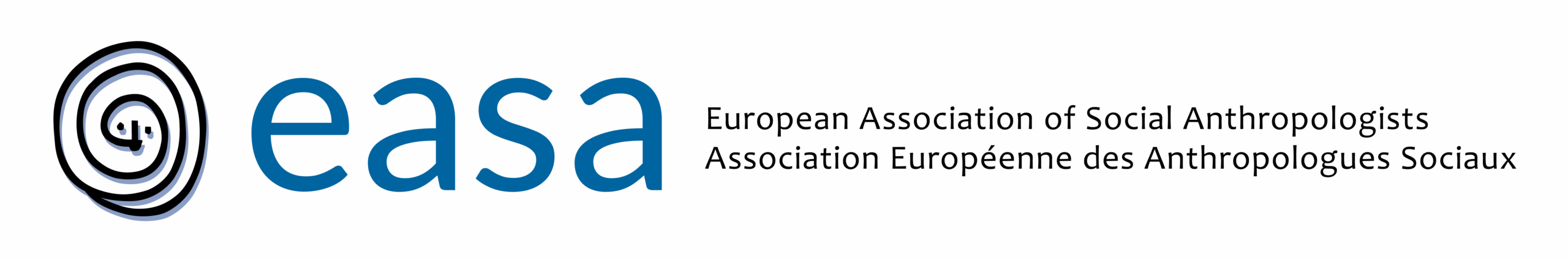
full versions
panoramic versions – could be used for web banners and emails
short versions
icons – for browser tabs, need to be square and should have good contrast and miminal number of colours